OrderSync
Design System Redesign
A scattered, effect-heavy marketing site rebuilt into a single navy-and-white design system, rolled out across the whole site, and kept honest with a custom screenshot-and-token audit pipeline.
See the redesign.
The same homepage, before and after. Scroll either panel to compare the full page top to bottom — both stay in sync. Toggle light and dark to flip both sites.
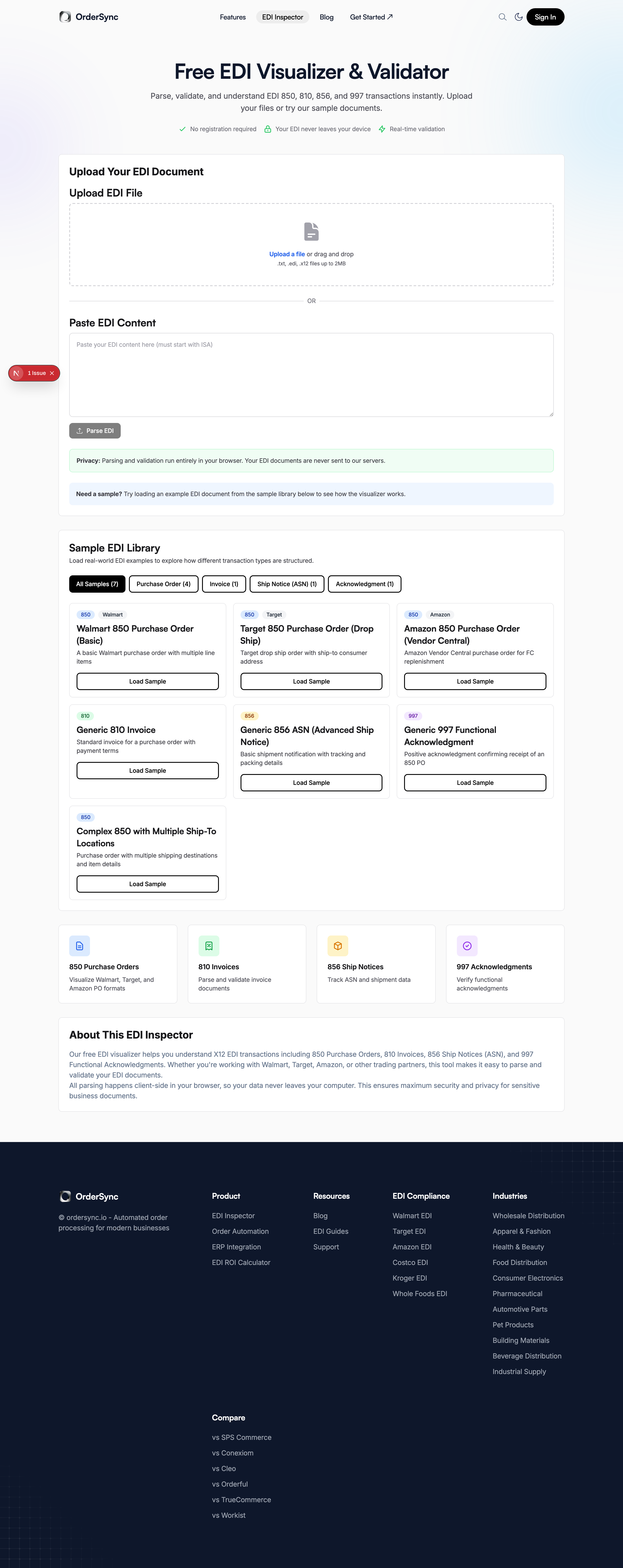
It worked, but it had grown without a system.
Years of feature pages, free tools, and programmatic SEO pages had each picked up their own styling. For a product that sells precision to operations teams, the inconsistency undercut the pitch.
Many names for "dark"
black, --navy, dark.DEFAULT, and --navy-bg used interchangeably across the codebase.
Competing accent families
Blue, purple, and cyan applied as shapes, links, and buttons with no rule for which went where.
Effect debt
Glows, floating orbs, glassmorphism, and animated gradients layered onto sections that didn't need them.
One-off components
Callouts, FAQ blocks, and CTA bands rebuilt by hand page by page — one change meant editing dozens of files.
Move more visitors to a booked call.
A trustworthy surface makes the product feel trustworthy. A clear hero and one obvious next action remove friction. And a maintainable system means future pages stay on-brand instead of adding new drift.
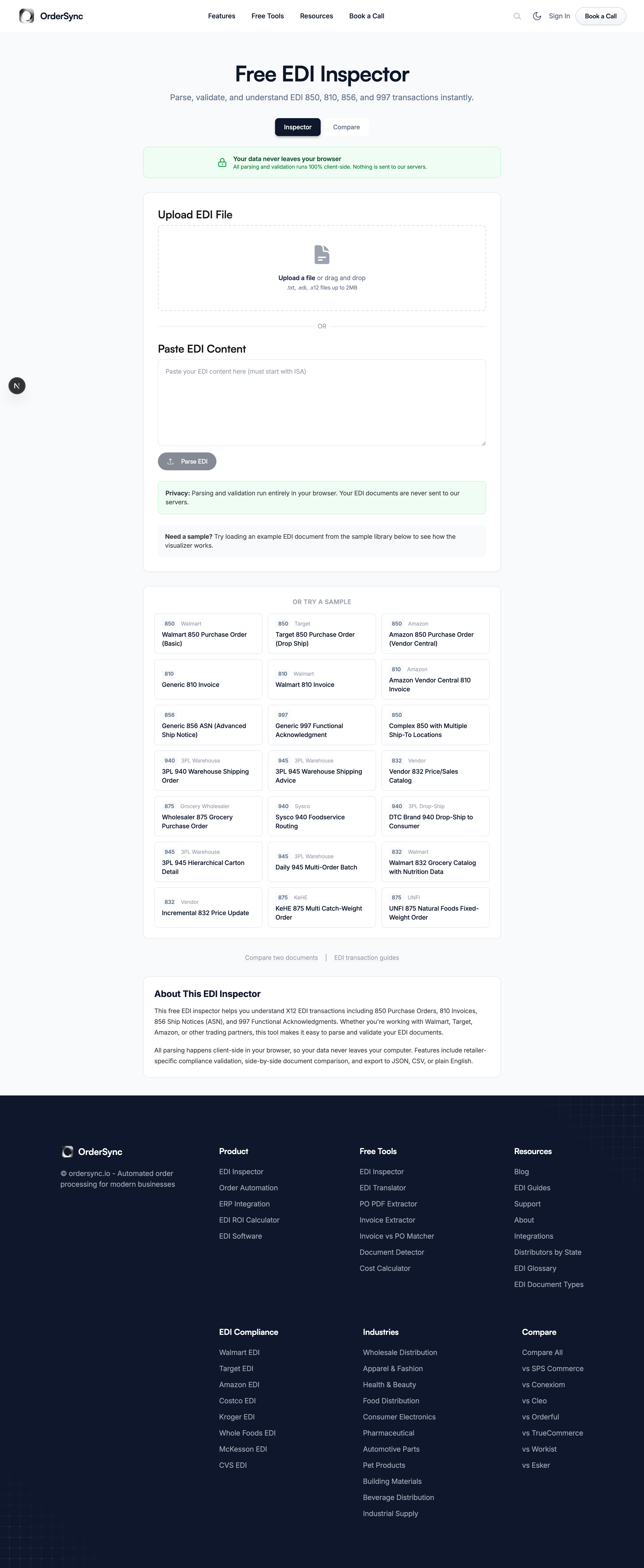
Four moves, one system.
Rebind at the source, not by hand.
Several "dark" names collapsed into a five-shade navy scale defined once as CSS variables. Every bg-black and bg-dark reference migrated automatically.
Every reference resolves to a small set of source tokens
Intent, not dark: modifiers everywhere.
Tokens like surface, content, and line swap their values under a .dark class. A heading is text-content — navy in light mode, white in dark — without the component knowing which mode it's in. New pages get correct dark mode for free.
A new page is an assembly job, not a styling job.
Almost every page is composed from Section, Heading (visual level decoupled from semantic tag), Button, and Eyebrow.
Keep only the motion that earns its place.
Out went the glows, orbs, glassmorphism, and animated gradients. What stayed earns attention: an animated document-flow diagram, a headline shine sweep, and word-by-word reveals. Restraint reads as confidence — which is the brand voice.
The system holds, page after page.
Landing pages and free tools, rebuilt on the same tokens. Each pair scrolls together, top to bottom.
A design audit that runs itself.
A design system is only real if the site actually follows it. So I built pnpm design:audit — a pipeline that proves it, across the whole site, with one command.
Read sitemap
Load every public URL from sitemap.xml.
Scan the DOM
Flag off-system styling against a library of violation patterns.
Screenshot light + dark
Capture full-page shots in both color modes.
Pixel-diff
Compare each page to a stored baseline and surface what changed.
- ✓Homepage rebuilt as the reference implementation for the system.
- ✓Core landing pages rebuilt on a shared template.
- ✓Tool, guide, comparison, and pSEO pages migrated onto the tokens.
- ✓Navigation restructured with a scroll-aware header and one clear CTA.
- ✓Shared conversion surfaces, instrumented end to end with PostHog.
Single source of truth
Color references resolve through a small set of tokens — a palette change is one edit.
Zero design debt
No off-palette colors or one-off components remain, verified by the audit pipeline.
One system, whole site
Every page inherits correct light and dark styling automatically.
A measurable funnel
Every CTA is instrumented, so the visitor-to-booked-call goal can actually be read.
The redesign's wins are in consistency and maintainability. Conversion impact is tracked in PostHog over time against the booked-call goal, so I've kept this to what's verifiable rather than quoting a lift I can't yet stand behind.
- →Wire a live data feed into the homepage counters.
- →Run the audit pipeline in CI so one off-system color fails the build.
- →A/B test hero headline variants now that the funnel is instrumented.